Understanding how color influences mood, memory, and connection in live experiences
 Before an event attendee or incentive winner reads a word, hears a speaker, or takes a seat, they feel something.
That feeling often begins with color.
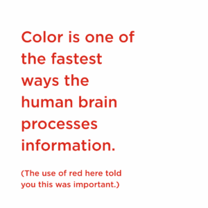
Color is one of the fastest ways the human brain processes information. Long before we consciously register design details, color sets emotional tone, influences energy, and shapes expectation. Researchers, psychologists, and designers have studied this relationship for more than a century, from early color psychology work by Faber Birren to contemporary research published in peer-reviewed journals and applied by institutions like the Pantone Color Institute.
At the same time, color is not universal or fixed. Personal memory, cultural context, lighting, saturation, and surrounding hues all influence how color is perceived. Color psychology is best thought of as patterns of emotional response that tend to emerge across people and environments, not as a set of rules.
In live events and experiences especially, color is not decoration—it is a design tool that guides emotion, movement, and memory.
Color Is Subjective, and Context Is Everything
Research confirms that people consistently associate certain emotions with specific hues, but those associations shift depending on context. A large-scale review of 128 years of color-emotion research, published in Psychonomic Bulletin & Review, found that while trends exist, emotional responses are shaped by brightness, contrast, and surrounding colors, not hue alone.
This is where event design becomes uniquely powerful. Guests don’t just see color. They move through it. They experience it across moments: arrival, anticipation, learning, celebration, and reflection.
How Colors Tend to Make People Feel and Where They Belong in Events
Red 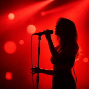
Emotion: Energy, urgency, intensity
Red heightens attention and amplifies emotional response. It signals importance and action.
[Heller, Psychology of Color]
Best event moments:
Reveals, countdowns, high-impact stage moments, celebratory accents.
Red works best as punctuation, not background.
Blue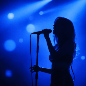
Emotion: Calm, trust, clarity
Blue is consistently associated with stability and focus. It has been shown to support concentration and reduce stress.
Birren, Color and Human Response; APA
Best event moments:
Arrival spaces, opening sessions, leadership messaging, learning environments where trust and credibility matter.
Green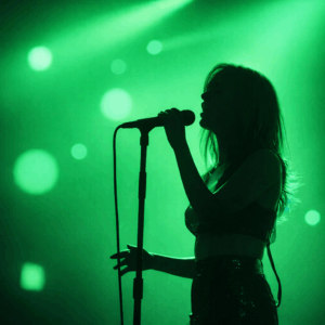
Emotion: Balance, restoration, ease
Rooted in nature, green is often linked to emotional comfort and renewal.
[Heller, Psychology of Color]
Best event moments:
Wellness activations, lounges, networking spaces, or environments designed to encourage conversation and recharge.
Yellow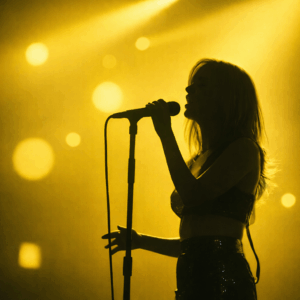
Emotion: Optimism, curiosity, creativity
Yellow is associated with joy and mental stimulation, but too much can feel overwhelming.
Best event moments:
Innovation zones, brainstorming sessions, wayfinding highlights, or moments meant to spark discovery.
Orange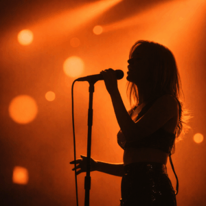
Emotion: Warmth, approachability, momentum
Orange blends the energy of red with the optimism of yellow, often evoking sociability.
[Birren, Color Psychology and Color Therapy]
Best event moments:
Networking receptions, social hours, interactive spaces where connection and conversation are the goal.
Pink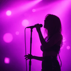
Emotion: Compassion, playfulness, emotional connection
Pink’s effect varies widely by shade, from soft and nurturing to bold and expressive.
Best event moments:
Celebrations, recognition moments, personal storytelling spaces, or environments meant to feel intimate and human.
Purple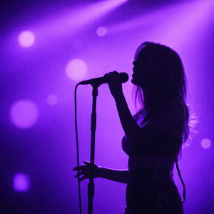
Emotion: Creativity, reflection, imagination
Historically associated with rarity and meaning, purple often evokes thoughtful inspiration.
[Pantone Color Institute]
Best event moments:
Creative sessions, evening experiences, immersive environments, or moments designed to feel elevated and unexpected.
White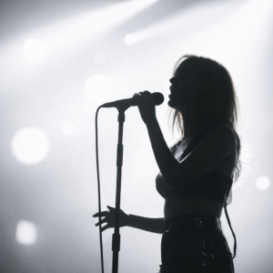
Emotion: Clarity, openness, possibility
White creates visual and emotional space, allowing other elements to stand out.
[Heller, Psychology of Color]
Best event moments:
Galleries, minimalist stages, transitions between high-energy moments, or spaces driven by light and projection.
Black
Emotion: Power, sophistication, focus
Black carries visual weight and creates contrast and drama when used intentionally.
[Birren, Color and Human Response]
Best event moments:
Evening programs, keynote reveals, high-impact moments where focus and intensity matter.
Gray
Emotion: Neutrality, balance, restraint
Gray supports without competing. It allows other colors to lead.
Best event moments:
Backdrops, professional environments, spaces where clarity and content should take precedence over stimulation.
Brown
Emotion: Warmth, authenticity, groundedness
Brown evokes natural materials and emotional comfort.
Best event moments:
Experiences incorporating wood, texture, or local culture; spaces meant to feel welcoming and rooted in place.
Why Color Pairings Matter in Event and Experiential Design
Color rarely exists alone. It exists in relationship.
Design research shows that harmony, contrast, and pairing dramatically influence emotional response. Complementary pairings can energize a space, while analogous palettes create calm and cohesion.
In events, pairings allow designers to shape emotional pacing:
- Calm arrivals grounded in blue and white
- Social moments energized by orange accents
- Celebrations heightened with bold contrast
- Reflection supported by softened, layered tones
The same color can feel entirely different depending on what surrounds it.
Where Color Lives Beyond the Obvious
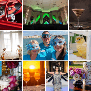 We all expect to see color in the familiar places. Invitations, banners, florals, linens, printed materials. These elements matter, and they set the visual foundation of an experience.
But some of the most powerful uses of color show up in places guests don’t consciously register, yet deeply feel.
Lighting and uplighting can shift the emotional tone of a space without changing a single physical element. Cooler hues calm and ground, while warmer tones invite energy and connection. Subtle transitions in lighting color throughout the day can guide how an experience unfolds, from focused to celebratory.
Typography carries emotion as much as message. The color of a name badge font, agenda headers, or directional signage can soften, energize, or elevate a moment without changing a word. Color becomes part of the voice.
Digital details offer unexpected opportunities for expression. QR code frames, session reminders, and screen transitions can reinforce emotional cues while maintaining a clean, cohesive look.
Comfort elements invite color into moments of care. Pillow accents, wellness spaces, and quiet rooms use color to signal rest, safety, or renewal. These are the moments guests remember as thoughtful rather than designed.
Architecture and movement create natural canvases. Elevator panels, hallway uplighting, stairwells, and entry thresholds can subtly shift color as guests move from one experience to the next, shaping anticipation and arrival without signage.
Even food and beverage can carry emotional color cues. A signature cocktail, garnish, or glass detail introduces color through taste and memory, turning a simple moment into a sensory anchor.
Color in these places doesn’t shout. It whispers consistency, intention, and care.
Color as Experience, Not Decoration
In live experiences, color is not just seen. It is felt, navigated, and remembered.
When used with intention, color guides emotion, supports connection, and helps define moments people carry with them long after the experience ends. The most impactful events don’t use color to follow trends. They use it to support purpose, shape feeling, and create meaning.
Because in the end, people may forget the details, but they remember how the experience made them feel.
[call_action]Let’s explore how color can shape your event experience.[/call_action]